 |
 |
Sign LanguageBy Donna Speidel
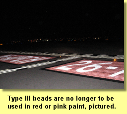
A recent change to FAA AC 150/5370-10F (Item P620 Runway and Taxiway Painting) now states: Note: The glass bead application rate for Red and Pink paint shall be reduced by 2 lb./gal. (0.24 kg/l) for Type I and Type IV beads. Type III beads shall not be applied to Red or Pink paint. (Note from Table 1 Application Rates For Paint And Glass Beads) With this new "sign language" in place, the FAA's intention is to make red and pink paint only marginally reflective by prohibiting the use of the brighter Type III high-index glass bead and reducing the coverage rates of either Type I or Type IV low-index glass beads.
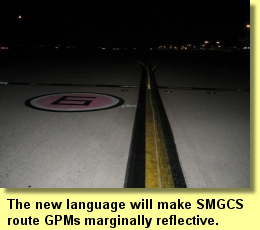
The most recent change has stemmed from discussion surrounding the issue of whether or not the red backgrounds on the red and white surface painted signs should be reflectorized. Some argue that the sign is more easily seen during darkness when the red background is not reflective and the white inscriptions are; thus the inscription appears quite bright. That may be so when one is right at the sign, but not at a distance. Distance recognition, after all, was the goal of the enhanced markings, so that the pilot could gain situational awareness sooner, thus be aware he or she was approaching a runway. The original theory was that if the red background were reflectorized, it would increase the visibility of the entire holding position environment, the area determined to be most susceptible to runway incursions. The change in language applies to pink backgrounds as well (e.g. Geographic Position Markings). However, the issue with the reflective background reducing contrast with the inscription doesn't exist in the case of a GPM. The inscription is black and is prohibited from being reflective. Therefore, reducing the glass bead coverage rate in pink paint will only reduce contrast in a marking vital to the Surface Movement Guidance Control System which was designed to provide superior visibility.
Take the pictures below for example. Each of them is unique in either application or composition. Since there are no quantitative criteria to determine how reflective a sign should be, as an industry we have to subjectively determine whether they are effective, or not. Click on any of the markings pictured below to see the details behind why they look the way they do. How do you want the markings to look at your airport?
|
 FAA Advisory Circular 150/5340-1K requires that certain airfield markings be reflective for enhanced visibility during darkness
or under low visibility conditions. In fact, the FAA included a recommendation that the high index (TT-B-1325D, Type III) or low index
(TT-B-1325D, Type IV) glass beads be used in the holding position environment to increase visibility and situational awareness. However, the FAA
has seemingly changed its mind about increasing visibility in red and pink coatings.
FAA Advisory Circular 150/5340-1K requires that certain airfield markings be reflective for enhanced visibility during darkness
or under low visibility conditions. In fact, the FAA included a recommendation that the high index (TT-B-1325D, Type III) or low index
(TT-B-1325D, Type IV) glass beads be used in the holding position environment to increase visibility and situational awareness. However, the FAA
has seemingly changed its mind about increasing visibility in red and pink coatings.
 There is some background, so to speak, as to why the FAA made this provision. Let's go back to 2003 when the FAA "Call to Action"
teams met to determine ways to reduce runway incursions. One team discussed ways to enhance taxiway markings to make the holding position
environment more visible, and increase situational awareness in the effort to reduce runway incursions. Included in the new marking scheme was an
enhanced taxiway centerline, addition of surface painted signs at the holding position marking, and an extension of the holding position marking
onto the taxiway shoulder. Since the time those markings were implemented, changes to their use and configuration have been made.
There is some background, so to speak, as to why the FAA made this provision. Let's go back to 2003 when the FAA "Call to Action"
teams met to determine ways to reduce runway incursions. One team discussed ways to enhance taxiway markings to make the holding position
environment more visible, and increase situational awareness in the effort to reduce runway incursions. Included in the new marking scheme was an
enhanced taxiway centerline, addition of surface painted signs at the holding position marking, and an extension of the holding position marking
onto the taxiway shoulder. Since the time those markings were implemented, changes to their use and configuration have been made.
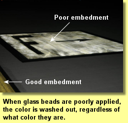 In our experience we have seen the "wash out" effect reduce contrast between inscribed characters and backgrounds when glass beads
(regardless of type) are not properly embedded in the coating (regardless of color). The directional sign, pictured left, is an example of how ALL
colors become washed out. The root of this issue, and conseuqently the reason for the new FAA language, is poor application; generally too
little paint is applied for 50-60% of the glass bead spheres to embed optimally in the coating. The root of the issue should be solved by training
the industry
In our experience we have seen the "wash out" effect reduce contrast between inscribed characters and backgrounds when glass beads
(regardless of type) are not properly embedded in the coating (regardless of color). The directional sign, pictured left, is an example of how ALL
colors become washed out. The root of this issue, and conseuqently the reason for the new FAA language, is poor application; generally too
little paint is applied for 50-60% of the glass bead spheres to embed optimally in the coating. The root of the issue should be solved by training
the industry